Brieff, an AI sales copilot you don't have to babysit.
A meeting-prep and follow-up copilot for Account Executives. A working, deployed product with live AI, taken through strategy, IA, UI, brand and front-end build.
- Role
- Product design: strategy → IA → UI → brand → build
- Type
- Self-directed, shipped live
- Status
- Deployed, live AI on seeded CRM data
- Stack
- Next.js, React, Tailwind, Groq
A1Overview
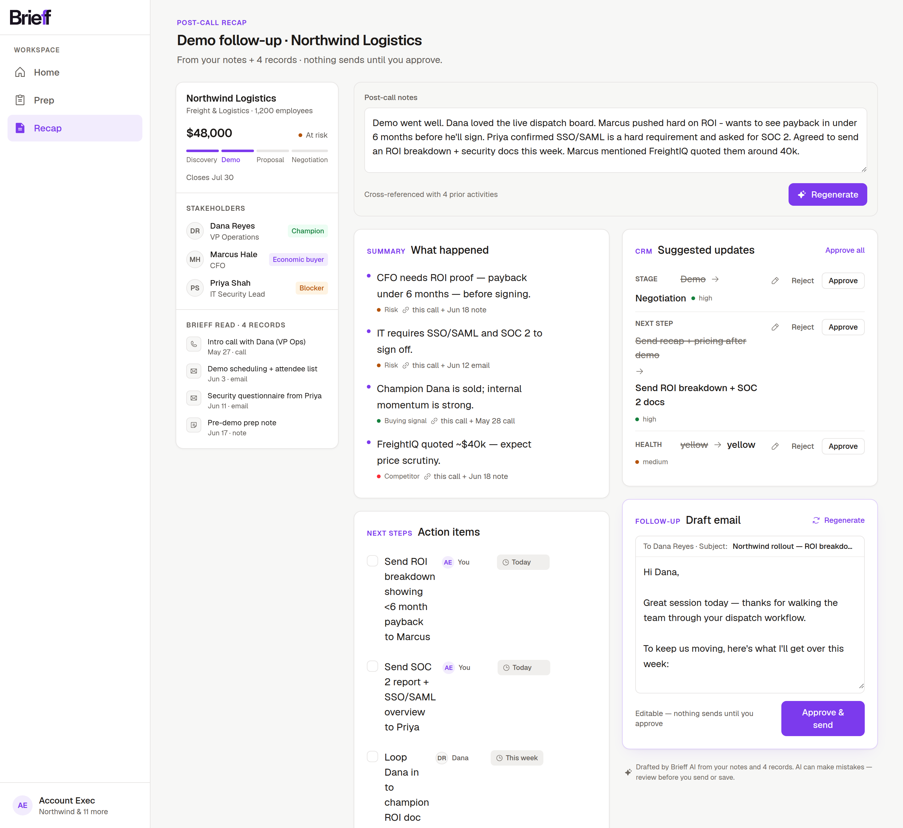
Sales reps lose one to two hours a day to call prep and CRM admin, and they distrust AI that’s slower, wrong, or uncontrollable. Brieff is a copilot scoped to one job, walk in prepared, close out the admin fast, built around a single thesis: the rep reviews and approves everything, and there is no chat.Every claim cites its source record, every output is an editable draft, and nothing is ever sent or written without the rep’s approval.
A2The problem
A mid-market B2B Account Executive runs 25-40 live opportunities and 5-8 calls a day. Between calls they’re reconstructing context (“who’s on this call, what did we last say, what’s at risk?”), and after calls they owe follow-up emails and CRM updates that pile up. That’s the 1-2 hours a day that isn’t selling.
The trap most “AI for sales” tools fall into: they add an assistant that’s slower and less trustworthythan the rep’s existing muscle memory. Real Salesforce-community pushback is blunt about it. If the AI is slower, less accurate, or less controllable than search, reps route around it.
So the real design problem: earn a skeptical power-user’s trust on one narrow, high-value job.
A3The wedge
An AE copilot inside the CRM, scoped to one loop: prep before the call, recap and follow-up after. Deliberately never a general office assistant. Narrow workflow, obvious business value, and a clear trust bar to clear.
The job to be done: “When I’ve got a call coming up and a pile of follow-ups after, help me walk in prepared and close out the admin fast, without babysitting the AI.” North-star metric: active selling time reclaimed per rep per week, surfaced in-product as a “Saved ~14 min” chip after each approved follow-up.
A4The four trust principles
Every decision had to honor these four principles. They’re the spine of the whole product:
- FastOne step, no chat ping-pong. It has to beat the rep's old shortcut, never be slower.
- TransparentEvery AI claim cites its source record (“from the call on Jun 12”).
- EditableEverything is a draft; the human approves before anything is written or sent.
- OptionalIt never blocks the rep's existing fast path. The AI stays a shortcut, never a tollbooth.
The biggest consequence of these principles was a thing I didn’t build: a chatbot.Studying M365 Copilot, I took its task-grade ideas (reassignable owner and due chips on actions, sales-signal tags on summary bullets, a responsible-AI disclosure line) and deliberately rejected its Q&A chat panel. A conversation surface violates “Fast,” and it invites exactly the babysitting reps already distrust.
A5The core loop
Three screens, one workspace shell.
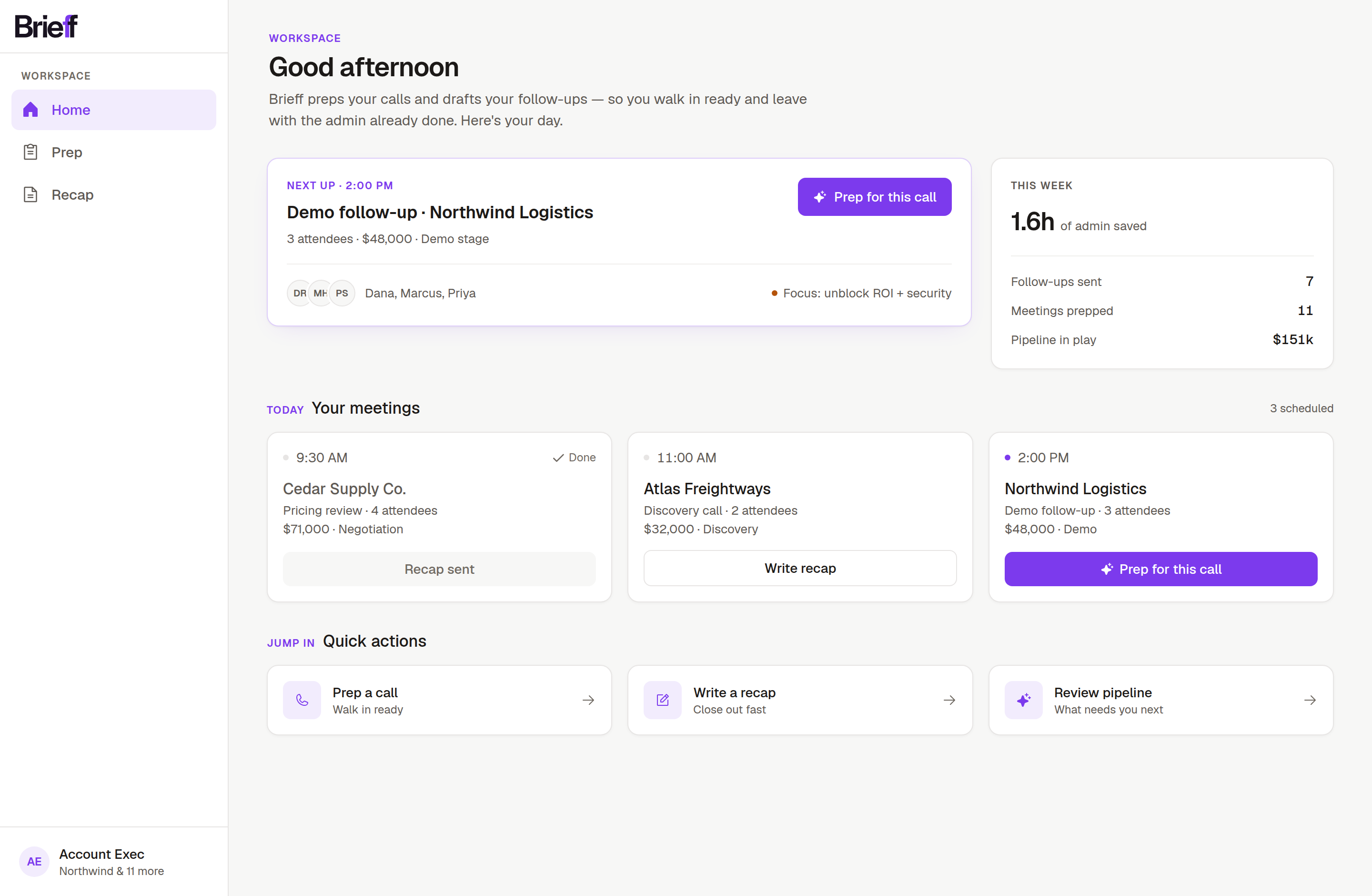
Home: the rep’s day. Next call, this-week stats, today’s meetings as a card grid, quick actions. A command center rather than a cold open.
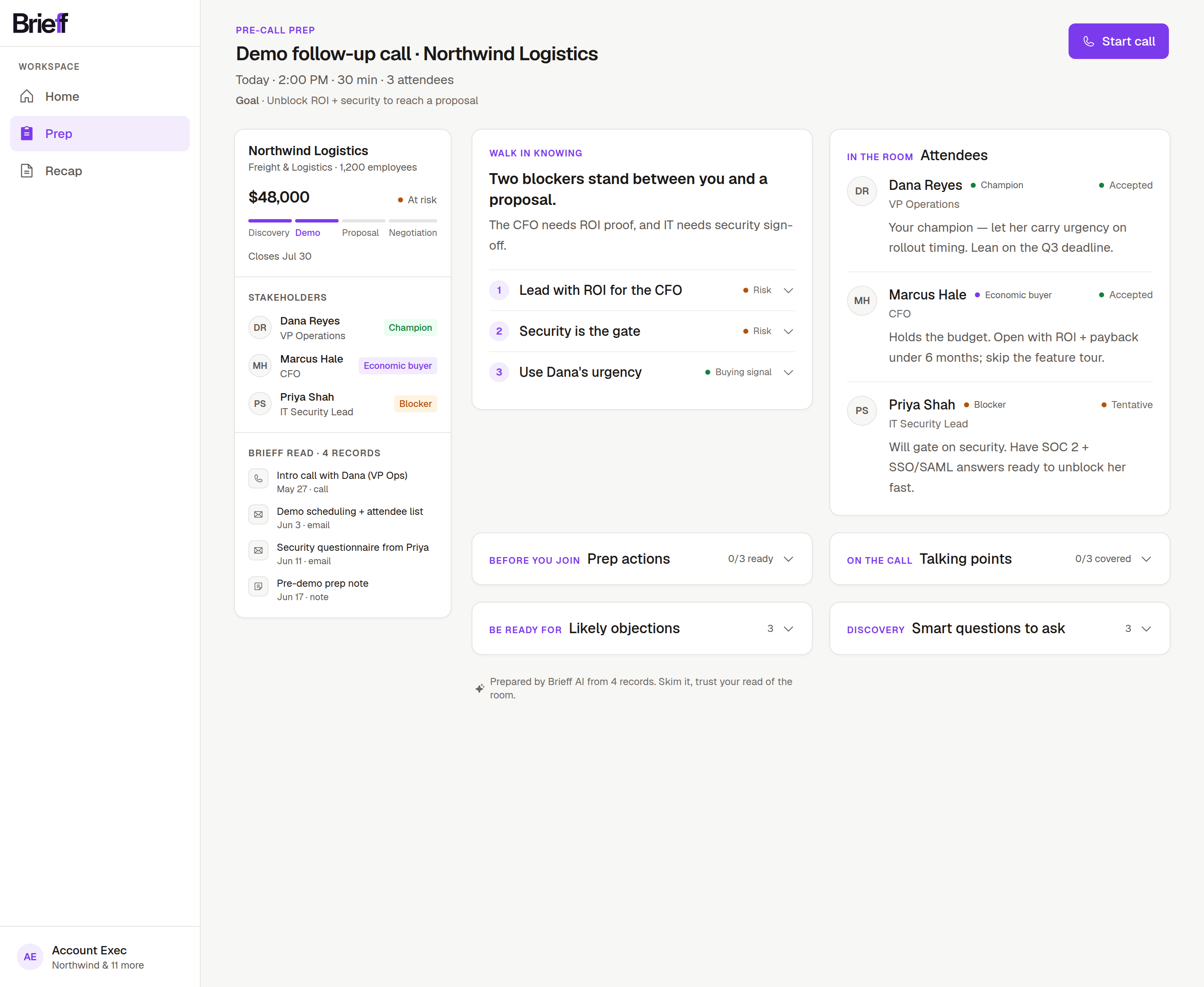
Prep: a read-optimized brief. “Walk in knowing” (one primary insight plus three supporting leads with the detail collapsed), attendees with roles, likely objections, and copyable discovery questions. The posture is skim, then trust your read of the room.
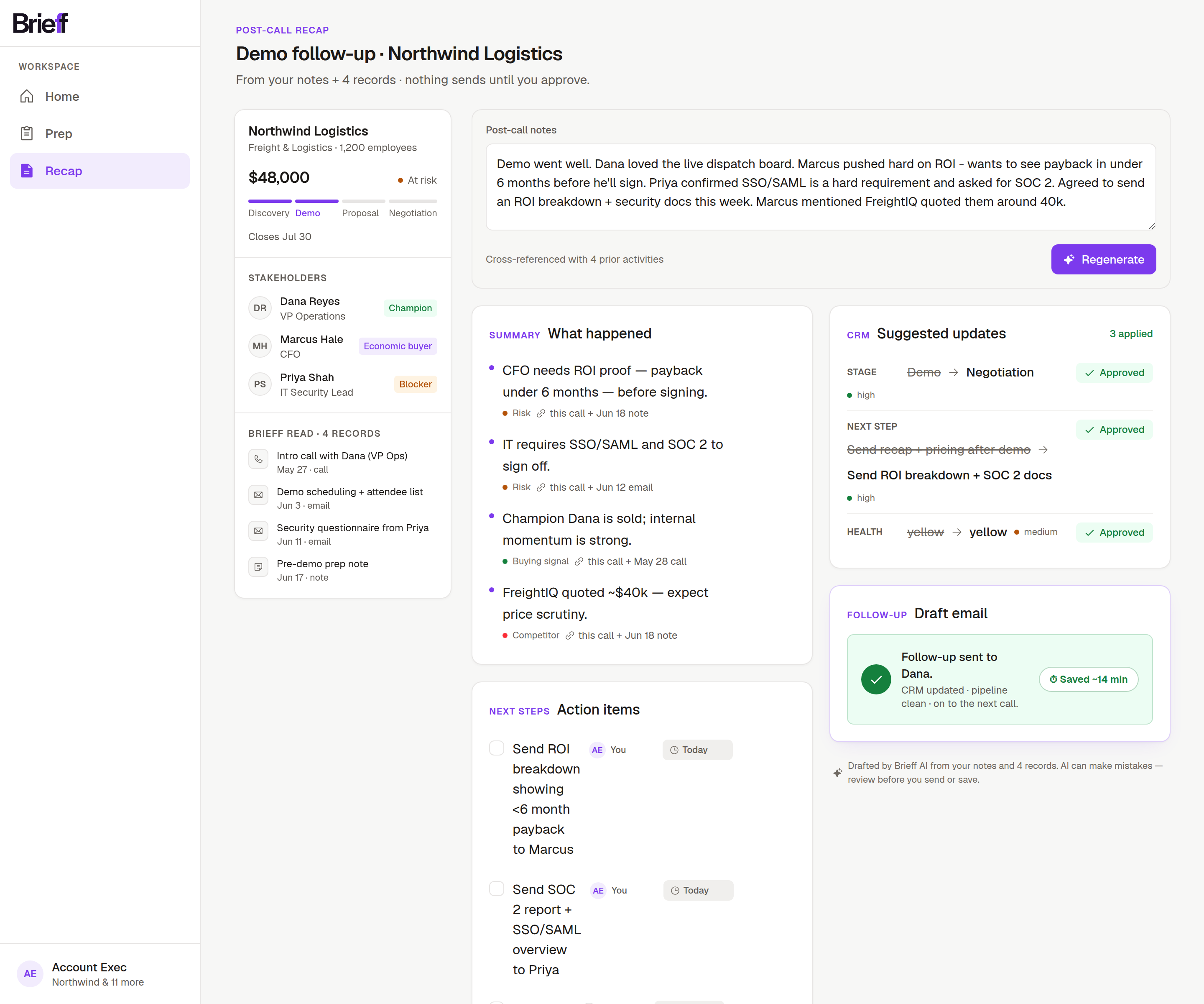
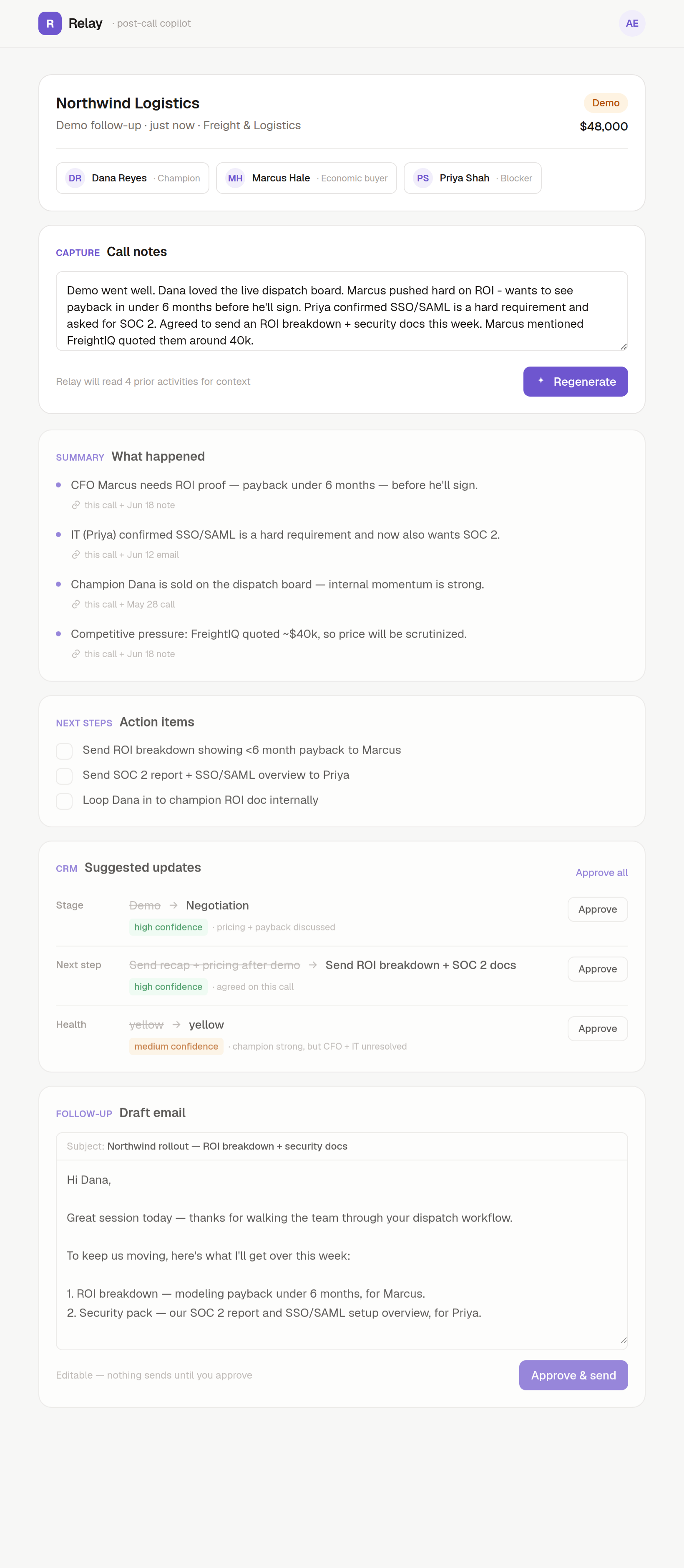
Recap, the hero: paste rough notes once and you get a cited summary, owner-assigned action items, a reviewable CRM diff (stage, next step, health, each one Approve or Reject), and a drafted follow-up email. Approve and send: “Saved ~14 min.” Transparency is made spatial here. A sticky left rail shows exactly which records the AI read (“Brieff read · 4 records”), and every bullet links to its source.
B1Selected design decisions
“The UI feels off”: the honest one.The first recap pass was a stack of identical white cards: monotone, low-density, and it read like a form instead of a workspace. I called it out myself, then fixed it research-first, locking references (Attio’s density, HubSpot and Gong’s left context rail, Linear’s section rhythm) and rebuilding into a two-pane layout: a sticky context rail beside a denser work column with the follow-up email elevated as the primary action. The rail is the Transparent principle made physical.
Accessibility isn’t optional. A contrast audit caught a metadata grey failing WCAG AA (2.52:1). I fixed the secondary and tertiary greys and introduced a stepped type scale (title, section, body, meta) so hierarchy comes from weight and color, never from shrinking text below legibility.
Fill vs. distribute.On wide monitors the layout either capped early (dead zones) or stretched single elements, a button floating alone at the far edge. The resolution: don’t add width, add columns. Dashboards fill with a card grid; record pages distribute into multi-column flows at comfortable widths. “Fill vs. cap” turned out to be a false binary. The answer is distribution.
B2The review that caught the product lying
After launch, a full code review of the live product turned up the most instructive bug in the project. Nothing crashed. It was a principle violation. Brieff’s first principle is Transparent, every AI claim cites its source record. But my server code, whenever the model forgot a citation, quietly stamped a default one (“this call”) onto the claim. And when the model omitted the minutes-saved number, it substituted 12. The UI rendered that fabricated evidence with the same citation chip as the real thing. The code was polite exactly where the principle demanded honesty.
The fix was a product decision more than a patch: drop uncited claims, never decorate them.A summary point or CRM suggestion without a real source is now removed before it reaches the screen, and the time-saved chip simply doesn’t render when the model gave no number. The reasoning is a trust argument. Content can be incomplete. Trust can’t be partial. One discovered fake citation poisons every real one, so a missing bullet costs less than a discovered lie.
The same review gate also caught a build-breaking mistake introduced during the bug-fix pass itself, a package rename that missed its lockfile twin. Which is the whole argument for the gate: nobody reliably reviews their own work, however careful. Two lessons I’m keeping. Process beats confidence. And design principles are requirements: testable, enforceable, reviewable. My automated review read my own design principles and caught my own backend violating them, and the fix was choosing honest incompleteness over fabricated completeness.
B3The rebrand: Relay to Brieff
The product shipped its UI as “Relay,” a placeholder that was generic and impossible to own. I coined Brieff, using the Workable/Airtable trick of doubling a letter to turn a real word into something trademarkable. It names the product (a briefbefore and after every meeting), and the doubled ff became the logo device: the wordmark reads “Brief,” and the second f carries the brand color.
The wordmark itself is drawn, not typed. It starts from Halyard Display, the brand’s display face, but I reworked the letterforms to make it ours: the r, the i, and of course the double f, tweaked and refitted until the pair reads as one mark instead of two letters standing next to each other.
The color work is the part I’m proudest of, because every choice has reasoning behind it, and I can defend all of it. The mark started purple on instinct, detoured into a bright azure, and the azure taught the lesson: it read like Facebook. Rendered comparisons showed why. A white letter on a dark rounded tile isthe Facebook/Messenger form, and blue is the sales-tech category default (Salesforce, Apollo, Outreach, Gong). A blue Brieff disappears into the crowd. So the way back to purple had reasoning behind it this time: the brief was “vibrant, with contrast against the warm paper,” and that’s a color-theory question. The background is yellow-warm, so its complementary is blue-violet, and violet pops hardest against it. I landed on vivid violet #7C3AED: vibrant but still credible for an enterprise-sales buyer. Magenta felt too consumer, and iris is the over-used Stripe/Linear lane. Then I tinted the near-black ink to #18121F so the neutrals belong to the accent family.
I also questioned whether the brand even needed a bespoke icon. For a young brand the research says no: wordmark-led, with a derived ff monogram for the favicon. I replaced the generic hand-rolled icons with Phosphor to escape the default shadcn-dashboard look. And because the design system is tokenized, the entire re-skin across three screens was a few-line change.
B4Reflection
The hardest and most valuable work here happened away from the pixels: deciding what to leave out (no chatbot, no bespoke symbol, no marketing landing) and defending choices with evidence instead of taste (category differentiation, complementary contrast, the trust principles). The trust wedge is the product. A copilot a skeptical rep will actually adopt because it’s fast, cites its sources, stays editable, and never gets in the way.
Brieff is deployed and live. Paste real notes and you get a real, context-aware recap, generated by a hosted model, with cached outputs kept as a graceful fallback so a demo never breaks. The thinking, the system, the brand, and a working product are all done. The point was always to ship something a skeptical rep could actually use, and that’s what’s live.