Subby, the AI sidekick for your subscriptions.
An app that scans your inbox, finds every subscription you're paying for, and shows you which ones to cancel. Designed, built and shipped solo.
- Role
- Product, design, engineering, launch. Solo.
- Timeline
- June 2026 · ~5 focused days over two weeks
- Status
- Live, invite-only beta
- Stack
- Next.js, Tailwind, Auth.js, Gmail API, Groq (Llama 3.3), Turso
A1Overview
Subby connects to your email (read-only), uses AI to read your billing receipts, and turns them into a clear audit: what you spend per month and year, what each subscription costs you per use, and which ones are quietly wasting money. I designed it, built it, and shipped it to a live beta on my own.
A2The problem
Most people have no idea what they actually spend on subscriptions. People estimate around $86 a month. The real average is about $219, roughly two and a half times more than they think. 42% have forgotten about a subscription while still paying for it. The money leaks quietly: the gym from January, two apps that do the same thing, a free trial that started charging months ago.
$86
what people think they spend per month
$219
what they actually spend (C+R Research, via CNBC)
42%
have forgotten a subscription while still being charged
A3Why existing tools fail
Subscription trackers already exist. The problem is they make you enter everything by hand. People do it for a week, then stop, and the tool goes stale. The manual upkeep is the friction that kills them. So the core bet behind Subby: it has to be automatic. If it needs constant manual work, it won’t stick.
A4Design principles
Three rules guided every decision:
- Value firstShow the audit experience before requesting access to someone's inbox. Trust is earned by demonstrating value first.
- Trust by architectureThe privacy promises are enforced in code, not just written on a page: read-only access, nothing from the emails is stored, and one click disconnects and deletes everything.
- EffortlessNo manual entry, ever. The AI does the work.
A5What I tried, what I kept
Subby did not arrive looking like this. A lot of the work was building versions, living with them, and throwing them out.
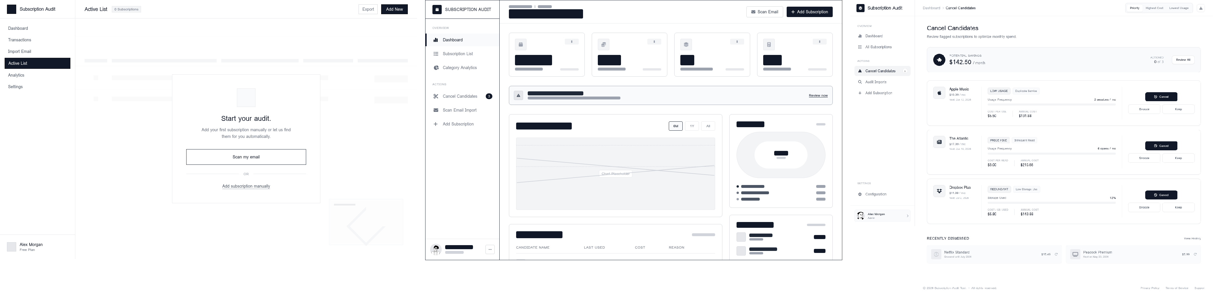
Wireframes first, color later. I started in black-and-white, low-fidelity wireframes to get the structure right before touching any color: the layout of the audit, the scan results with their confidence levels, the onboarding. Working in grayscale kept me honest about hierarchy and flow, instead of letting a nice color hide a weak layout.
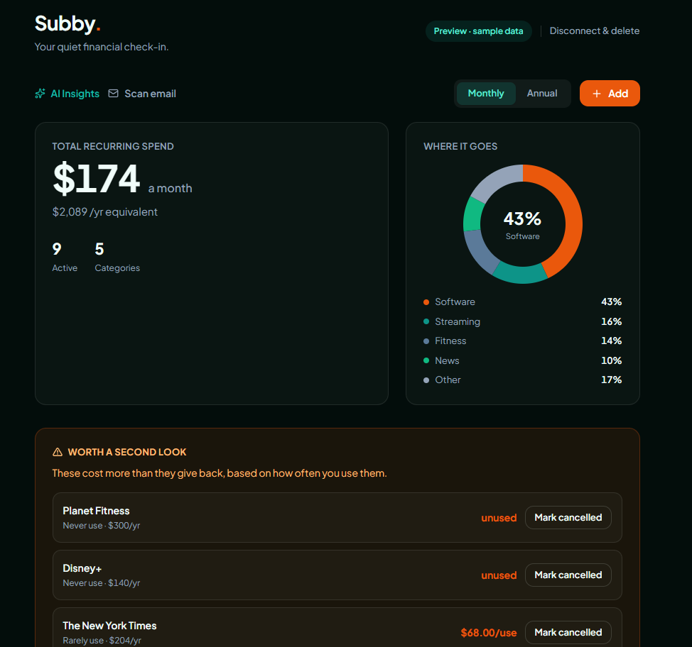
Dark for techy, teal for friendly. The final identity is a dark theme with a teal accent, and that pairing is the whole point. The dark carries the technical, capable side. The teal warms it up and gives it the friendly sidekick feeling, so the app reads as a companion and not a cold finance dashboard. I kept it dark only.
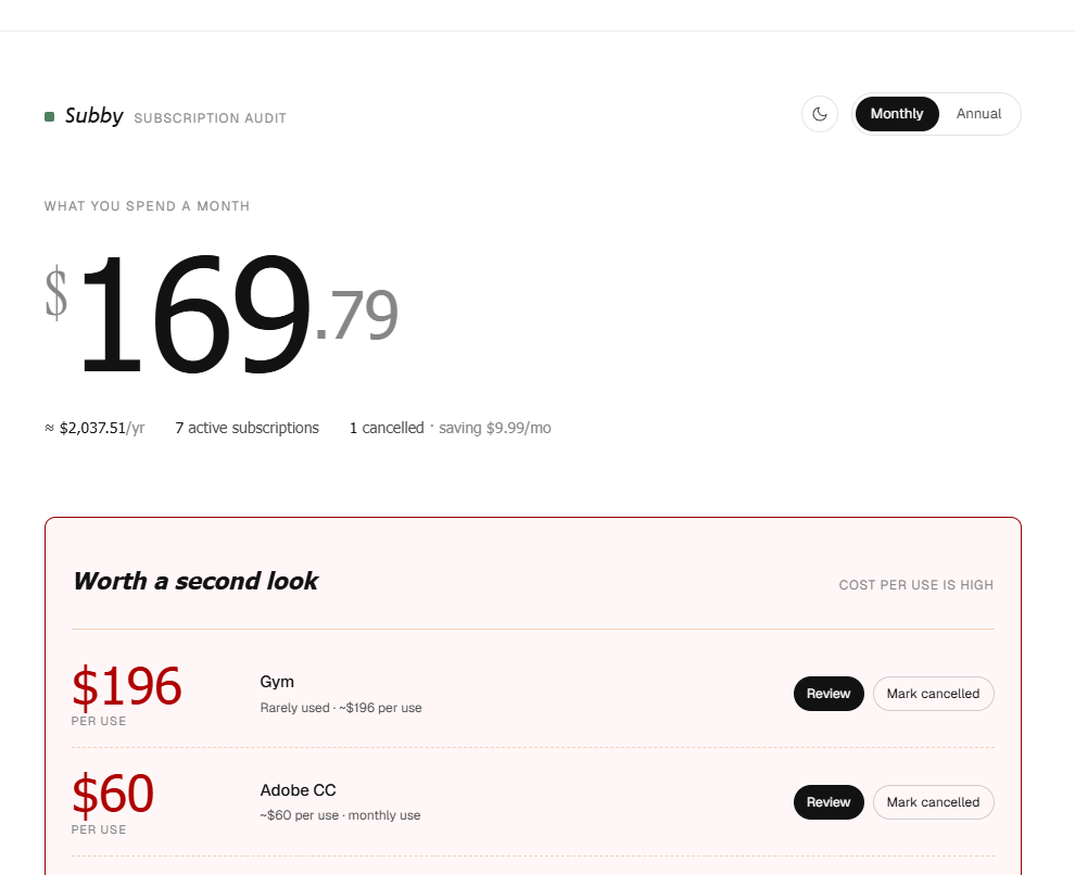
The looks I dropped. One version was white with a green accent, but the green was a generic, off shade and the type did not match the techy sidekick personality I wanted. An earlier light design had color combinations I was never happy with. None of them felt like Subby, and ruling them out was how I found what did.
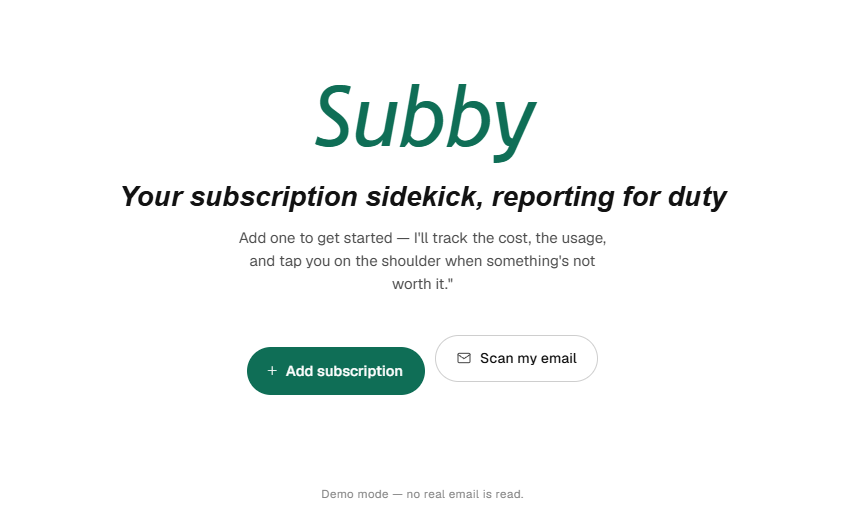
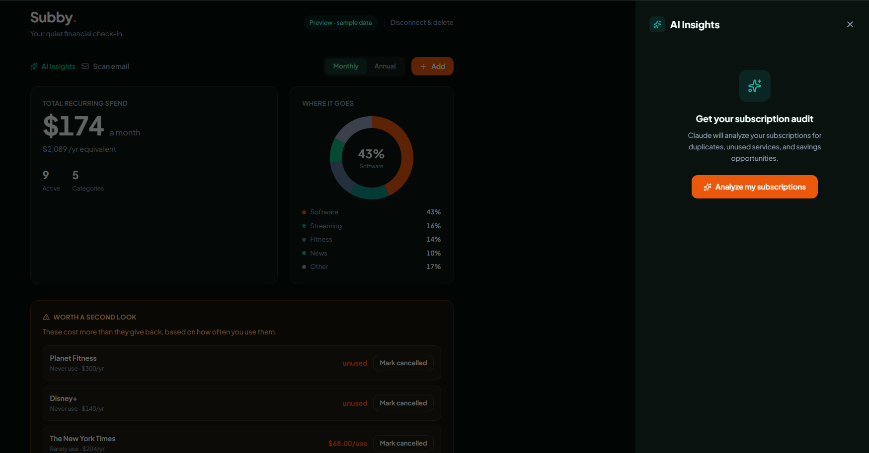
The money as a shape. The spending breakdown was a donut from the very first wireframe, and it never changed. A donut shows proportion at a glance, which is exactly what people want to know. What I cut was the usage-versus-cost scatter plot sitting next to it. It looked analytical but took real effort to read, and the donut plus a plain cost-per-use number already told the story faster.
Fewer numbers, clearer story. The lo-fi split the summary across three separate cards plus a cancel-candidates rail. It showed everything at once, and it felt busy. The final folds the headline spend into one figure that flips between monthly and annual, keeps the donut, and lets the rest go. A calmer screen suits an app that is meant to feel like a quiet check-in, not a finance terminal.
Softening the nudge.The “worth a second look” callout began as a blunt “cancel candidates” list with hard cancel buttons, and it felt too aggressive. I kept the feature but softened the language and the colors so it reads as a calm suggestion instead of an alarm. A sidekick points something out, it does not shout at you.
B1How it works
When you connect Gmail, Subby (read-only) pulls your billing and receipt emails, sends the text to an AI model that extracts each subscription (name, price, frequency), stores only those results, and renders the audit: totals, cost-per-use, category breakdown, and cancel candidates. Built with Next.js, the Gmail API for read-only access, Groq running Llama 3.3 for the extraction, and Turso for the database.
B2Key decisions
A demo is not validation. Early on I built a polished interactive demo. It looked great, but a demo on fake data only proves the pitch is appealing, not that anyone wants the product.
The AI was the easy part. The model that reads an email and pulls out a subscription is a cheap, commodity API call now. The AI was never the real challenge.
The real product is trust. The hard problem is getting someone to let an app read their inbox. So I borrowed the playbook fintech apps use: show value first, explain exactly what happens in plain language, ask for the minimum (read-only), and make leaving instant.
My own principle caught me.One of my rules was “trust by architecture,” privacy enforced in code and not just promised on a page. Before opening the beta wider, I ran a security pass on my own work and found the opposite of that promise: the app was storing the Google keys to people’s inboxes as plain, readable text. It worked perfectly, which is exactly what made it dangerous. I encrypted the tokens so they are useless without a separate secret, added rate limits, locked down the headers, validated every input, and hardened the AI step against emails written to trick it. The lesson stuck: code that builds is not the same as code that is safe, and shipping is not the finish line.
Designed for the AI being wrong sometimes.A free newsletter or a “your settings changed” update can look a lot like a paid subscription. Instead of pretending the extraction is perfect, I had the model attach a confidence level to every result and separate the obvious paid subscriptions from the maybes. Showing the uncertainty honestly turned out to be more useful than hiding it.
Shipped for $0.Free AI inference, free database, free hosting, and Google’s testing mode. Money is no longer the barrier to building a real product.
B3The result
The audit makes the invisible visible: a clear monthly and annual total, where the money goes by category, and a “worth a second look” list that flags subscriptions costing more than they are worth.
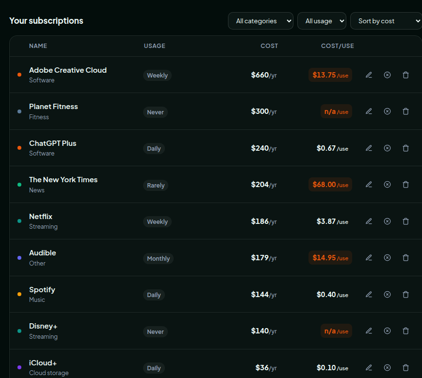
The idea I am proudest of: cost per use. Most subscription tools show you what something costs per month. Subby shows what it costs every time you actually use it. A streaming app you open twice a month is not really fifteen dollars, it is seven fifty a watch. Turning an abstract monthly charge into a number you can feel is what makes someone finally cancel. The price was never the problem. The price per use is what changes the decision.
B4What the beta taught me
Rather than guess whether people want this, I put it in front of real users. Around five people tried it, and the most useful results were not numbers, they were what the experience exposed.
“Wow, I didn’t know I had that subscription still going. Let me double-check if I’m actually paying for it.”
“I like that Subby says if it’s high or low confidence, because this one isn’t an actual subscription I’m paying for, it’s just a newsletter.”
Trust is the wall, exactly as predicted. The hesitation was never about the design or the audit itself. It was about handing inbox access to an app built by someone they had never heard of. A known brand gets the benefit of the doubt here. An individual does not. That confirmed the core bet: the hard part of this product is not the AI, it is earning permission.
Email is an incomplete signal, and I chose it that way. The scan does not catch every subscription, and that is partly a deliberate tradeoff. I kept it narrow and non-invasive on purpose because the whole point was to be trustworthy. So I traded some completeness for privacy and trust, and at this stage I would make that trade again.
It only works with Gmail. The read-only access is built on the Gmail API, so anyone on Outlook or Yahoo cannot use it yet. That quietly rules out a large share of people, and it is the first thing I would expand past the beta.
Put together, these point at the same place. The real design problem is not making the audit clearer, it is the tension between being thorough and being trusted. As an unknown builder, I leaned toward trusted.
B5Reflection
You can ship a real, full product solo now, design, code, AI and all, faster and cheaper than I expected. The hardest problems in an “AI product” usually are not the AI. They are trust, onboarding, and getting someone to take the first step. The beta proved it: people stalled at the inbox permission, not the interface.
Code that builds is not the same as code that is safe. Catching the plaintext token problem before launch taught me that shipping is not the finish line. Making it solid is part of done.
It is early and there are no big usage numbers yet. The most valuable thing so far has been learning where the real problem lives, which is trust, not technology. That is the next chapter.