Convite, the moment an admin trusts the product with their client.
A client-operations platform for small service teams, and an invented one: the product is fiction, designed as a self-directed case study. The method is real. The numbers are modeled, never measured, and labeled that way throughout.
- Role
- Research, product thinking, brand, UI, prototype, copy. End to end.
- Timeline
- July 2026 · one focused week
- Status
- Fictional product · working interactive prototype
- Stack
- Next.js, Tailwind, shadcn · research and decision ledger in the open
A1Overview
Convite is a client-operations platform for small service teams: projects, approvals, and client access in one place. New workspace admins were dropping off before their team ever reached first value, because onboarding asked them to make permission decisions they didn’t understand yet, with stakes they understood all too well. Give a client the wrong role and they see your internal work.
I redesigned the onboarding around one structural idea the market hadn’t tried: split the permission decision instead of front-loading it. Inviting a teammate became a zero-decision move. Client access became a separate, later, guided moment, with a live preview of exactly what the client will see.
A2The problem
The persona is a new workspace admin. An ops lead, a team lead, a finance admin. Someone responsible for setting the product up for everyone else, and usually the least technical person in the room. Their goal is to get the team set up quickly and correctly. Their fear is specific and justified: one wrong permission and the client is reading your internal notes and your margins.
The classic mistake in this space is measuring completion instead of activation. Teams finish sign-up and still never reach first value. So I locked the success metric before drawing a single screen, and every decision below had to trace back to it. Wizard completion, invites sent, checklist progress: all secondary.
Activated = a teammate accepts an invite and takes an action in the admin’s first project, within 10 days of workspace creation.
A3What eight products taught me
I tore down the admin onboarding of Slack, Notion, Linear, Asana, Airtable, ClickUp, Monday, and Figma, and studied permission patterns across those plus Google Drive, GitHub, Stripe, and the client-portal tools. Twenty-five-plus stats, each one tagged hard-data, vendor-claim, or folklore. The core insight, and the thesis of the whole case study:
Every product surveyed defers roles and permissions out of onboarding entirely. Invitees default to member. Role management hides in settings.
That works for Slack or Linear, where a wrong default is harmless. It fails for a client-ops platform, where the entire point of permissions is that clients and teammates must see different things. Putting role dropdowns back into signup would just kill completion, the research is unambiguous about that. The move that actually works is splitting the two decisions generic onboarding collapses into one: teammate invites as frictionless as Linear, client access as reassuring as the client-portal tools.
0 of 8
surveyed products that ask role questions during signup
>50%
completion drop once a wizard passes five steps
3
competitors that independently invented client-view preview
A4The baseline, built honestly
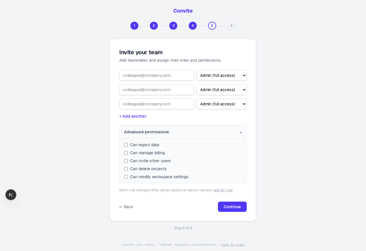
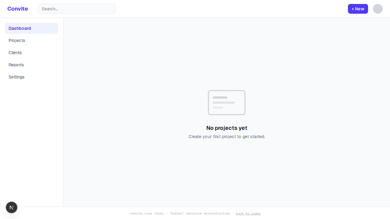
To have a real comparison, I built the flow Convite would plausibly have shipped without this thinking, assembled screen by screen from the failure patterns the research documents: a six-step wizard, an email-verification gate mid-flow, a survey, role dropdowns defaulting to Admin, permission checkboxes written in ACL jargon, and a dead-end empty dashboard at the finish line.
It’s deliberately competent but generic. The test was whether it felt like every other onboarding. It did. That’s the validated baseline the redesign gets measured against.
A5The name, and the look
Convite is Spanish for an invitation to a shared gathering. In Colombia, a convite is the tradition of neighbors invited to build something together: a road, a house, a project that ends up belonging to everyone. It reads three more ways once you look: co plus invite, Latin con for together, French vite for fast. That’s the part I love most about the name: the product is an invitation to build together, and so is the word. It also ties this record to home, the same country as the island you dove through to get here.
The visual direction is warm voice, sharp bones. Bricolage Grotesque announces, IBM Plex Mono instructs, and the rule is functional: if text states a boundary, a status, or an instruction, it’s mono. The permission boundaries are literally typeset in the instrument voice. Parchment canvas, hairline borders, one blush moment per screen, sienna for accents. I rejected the serif that usually comes with editorial warmth, because parchment plus serif is the current AI-generated-design cliché, and this direction’s real signature is the mono discipline.
B1A wizard that ends inside your work
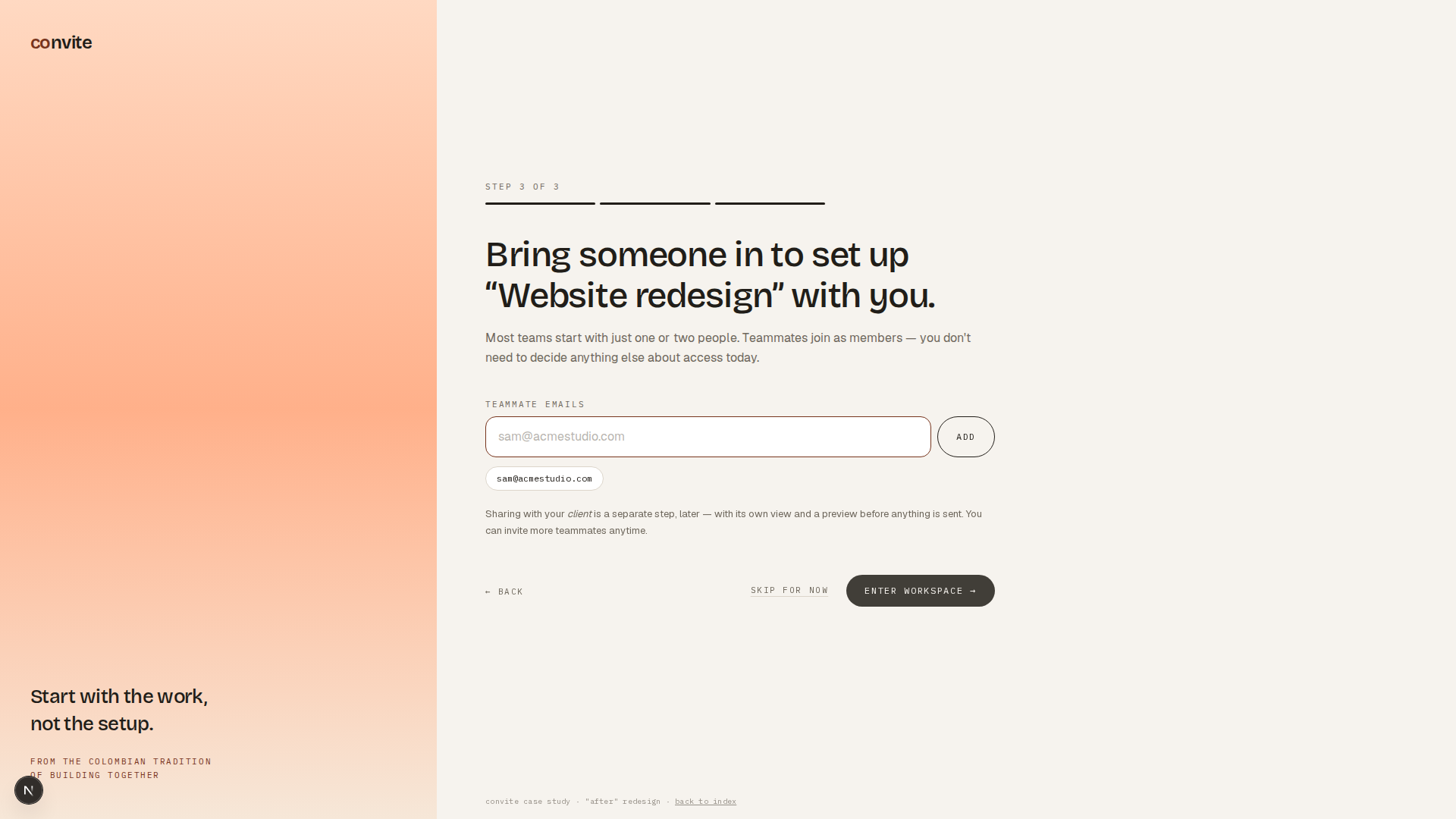
Three steps, everything skippable, no role decisions anywhere. Workspace basics first, with a domain auto-join offer that removes the invite bottleneck permanently. Then create your first client project, with real data: what you’re working on and who it’s for. Then invite a teammate into that project. “Bring someone in to set up Website redesignwith you” is a different ask than “invite people to an empty tool.” Teammates are members, full stop. The copy promises that client sharing is a separate step, later, with its own preview.
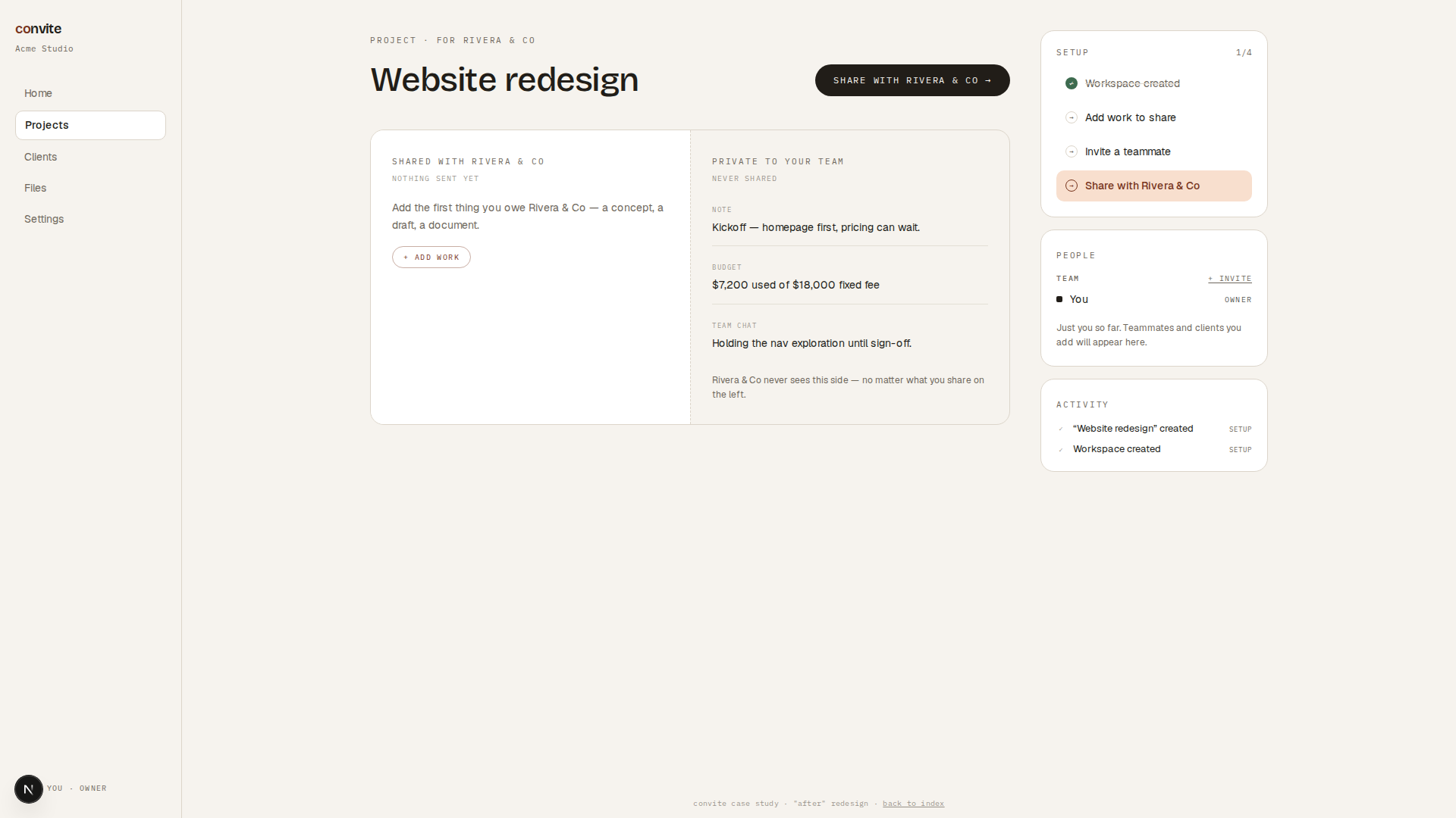
The workspace opens with that project already populated and a four-item checklist that starts with one item pre-checked. Endowed progress, which nearly doubles completion in the published research. Every unfinished item is a button that opens its action, and that rule has an honest origin: testing my own prototype, I couldn’t find where to add work from the checklist. It named the task and then left me hunting the dashboard for it. A checklist that names tasks without opening them is a to-do list, and onboarding deserves better.
B2The boundary as layout
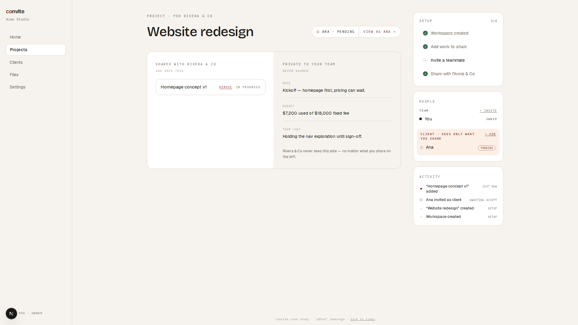
The workspace’s centerpiece is a single panel split down the middle by a dashed line. Left, on white: shared with the client, empty until you put something there. Right, on parchment: private to your team, pre-furnished with a note, a budget line, and team chatter. Nothing in the workspace explains the permission model. The layout draws it.
An earlier version used two separate cards, and I lived with it for a while before seeing the problem: it expressed the product’s core boundary as a gap between boxes. The final version is one surface with a real line through it, because the boundary is the product. And the two sides start unequal on purpose, private side furnished, shared side empty, so on first landing the layout itself says your work is private by default.
B3The client-share moment
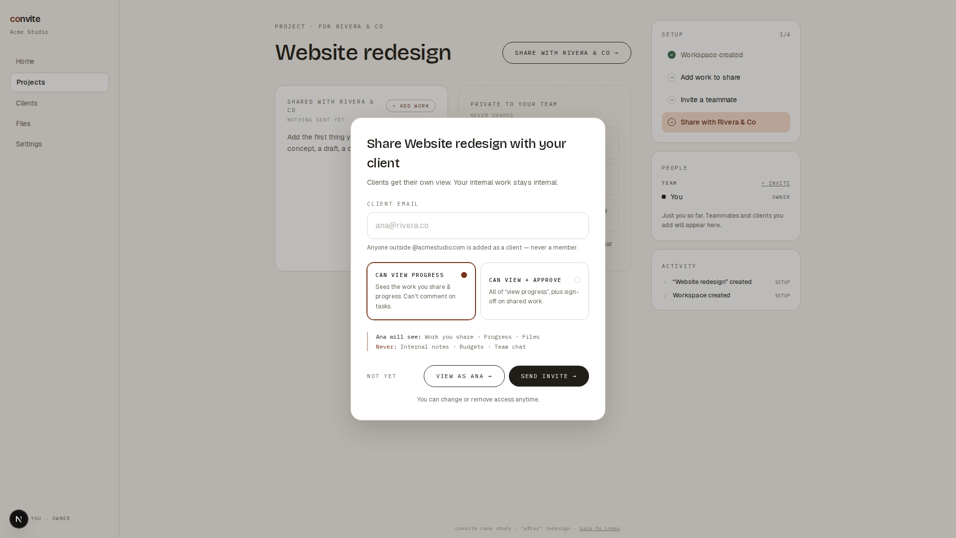
Sharing with a client is a completely separate action from inviting a teammate. Different button, different modal, different rules. It classifies by domain, with guardrails in both directions: type an internal email in the client modal and it points you back to the teammate invite. Type an external one in the teammate modal and it warns you exactly what membership would expose. The admin never has to remember the safe choice.
It offers exactly two roles, named as verb phrases: can view progress, or can view and approve. Under them, consequences as a live readout. “Ana will see: work you share, progress, files. Never: internal notes, budgets, team chat.” Pick the approve role and approval requests appear in the list, because the readout is a consequence of your selection. An earlier version styled it as a bordered box and it read as a third card you could select. The fix worked from both directions: selection dots made the real options more option-like, and stripping the border turned the readout into an annotation.
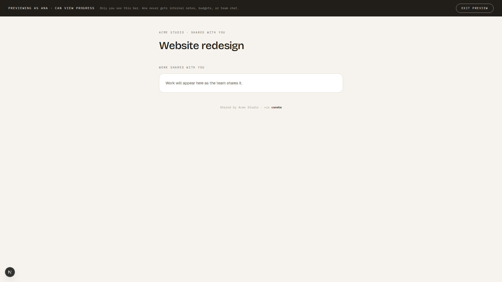
Then the feature this case study exists for. Preview as Ana renders the entire client view full-screen, with an ink banner only the admin sees. And because the private zone is furnished, the preview demonstrably omits real content you were just looking at. The number one fear, what exactly will my client see, gets answered by actually showing them. Three competitors independently invented this reassurance at the grant moment. When that happens, the category is telling you it found a requirement.
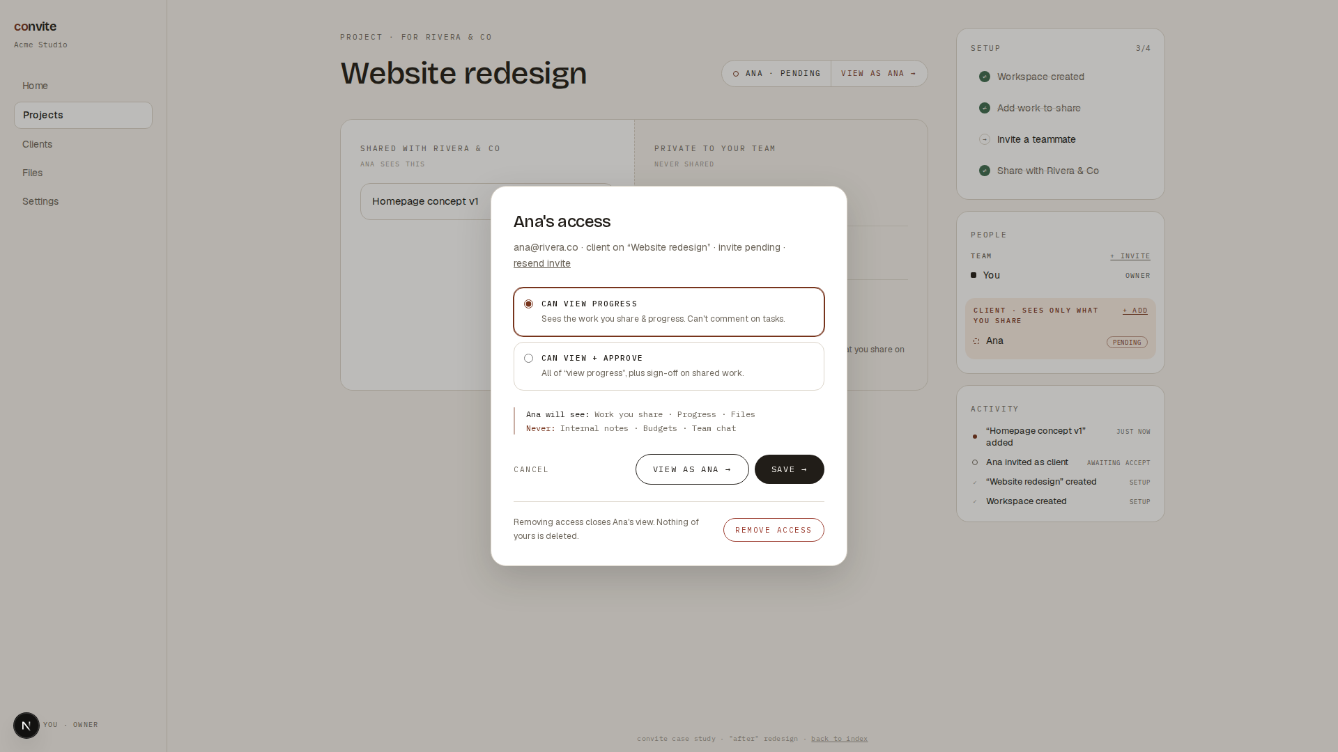
And everything is reversible, and says so. Roles change from a per-contact modal where the readout updates live. Remove access sits in a quiet danger zone below a divider, findable and deliberately calm, with the reassurance this persona actually needs: removing access closes Ana’s view, nothing of yours is deleted.
B4Crit rounds, and what got cut
The prototype went through five structured critique rounds. A sample of what they caught: a quote-rotation animation that double-exposed text, modal buttons that broke on long email addresses, a people panel that mixed teammates and clients in one list, and status chips distinguishable only by color.
Just as important is what got refused, because scope discipline is a design decision too:
- Full CRUDEditing and renaming work items, real notes and budget sections. It would make the product bigger without making the boundary clearer. The prototype's job is one workflow, deep.
- Timeline pillsProject phase pills on the workspace. Built them, lived with them, deleted them as confusing.
- A serif faceRejected at the brand stage. Parchment plus serif is the cliché; the mono discipline is the signature.
Every proposed change had to pass one question, and it turned scope debates into fast decisions:
Does this make the boundary story clearer, or does it make the product bigger?
B5Outcomes, modeled honestly
Convite is fictional, so these are modeled targets bounded by published evidence. Nothing here was measured, and the real discipline was refusing to claim numbers the evidence can’t support.
~28%
baseline activation, modeled at the published B2B median
low 40s
modeled activation after the redesign, capped by the evidence
+10–21%
the published onboarding and checklist lifts that set that cap
Stated the way I’d state it to a real team: these are the targets I’d put on the wall, with the instrumentation plan to verify them. Activation events on invite-accept plus first project action, funnel steps on the wizard, ticket tagging for setup issues. Claiming more would exceed the evidence.
B6Reflection
Preview-as-client only works because the whole system makes it provable. The furnished private zone exists so the preview has something to omit. That’s the part I love most in this project: the best feature here is really an argument the interface can win.
Splitting a decision beats simplifying it. The market either front-loads roles or hides them. Splitting teammate from client let each half be radically simpler than any simplified combined flow could be.
Critique needs a razor. The litmus test turned taste arguments into fast decisions, and it’s a habit I’m keeping for real product work. What I’d build next: the members and access settings screen with a capability table, time-boxed client access with expiry and one-click extension, and the actual instrumentation, so the modeled numbers can be replaced with real ones.